Monday, 25 April 2016

Different Types of Animation


Traditional Animation: 
Hand drawn animation (each frame is hand drawn), use to be a dominate 
form until computer animation


illustration 2d animation gif


2D Vector based animation: very similar to "Traditional 
Animation" but it is using a computer. it has bitmaps and vector graphics to edit said animation.


3D computer animation: having the animation look, well 3D! the heart of games and virtual reality. can be edited to look realistic.


Motion graphics: animation that gives the illusion of rotation/motion. 


Stop Motion: frame, by frame, by frame, of an object. Gives illusion of movement.

Thursday, 21 April 2016

Portraiture

Profile

Frontal
3/4
Close up

Shoulder length
Mid-shot
Full-shot
High angle


Low angle
eye level

Monday, 18 April 2016

Friday, 15 April 2016

The Photo Portfolio Assignment

Low angle

High angle
Building or Machine
Landscape/Cityscape
Pattern
Framed 


Interesting Shape(s) or Texture(s)


Macro


Reflection


Perspective using converging lines


Friday, 8 April 2016

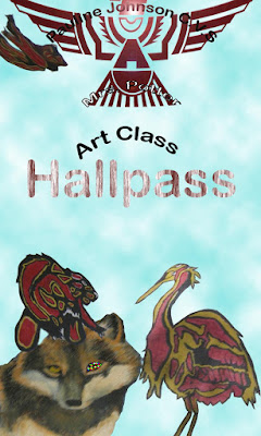
Pj Hall pass Creations

Few of the effects i used for this one were.

Filters-The background and the letters (the P, and the J) and the crest all have filters. The background was first gradient then used oil painting.

Type- Well this one is a bit obvious, I used the type tool for well typing.

Magnetic Lasso Tool- To get the P and the J I had to cut it out from a picture I used

3D mode (Or 3D tool?)- For the "hall pass" lettering I used "3D mode" to make the letters 3D 

Colour Picker- To change the colour of the letters (Seen in C.V.S) I had to use the colour picker for changing the colour


Lens Flare- In this Picture I used the lens flare on the PJ Thunder Bird and on the Johnson part of Pauline Johnson

Magic Wand Tool- I used the magic wand tool to quickly (and easily) cut out the Thunder Bird and put it in the picture.

Warp Text- I used that tool to put an arch in the words (look at "Art class" for an example)

Blur tool- I used the blur tool a little bit on the beavers paw (to blend it in) 

Rectangle Tool- I used that tool for the starting colour of the background (well then I changed it)
   Burn Tool- I used that to make the edges (or rounded parts) of the thought bubble. to make them darker.

Gradient Tool- Yes I did say this in the filters but the way I used the gradient tool was in a squared line shape (the Square Lines) 


1. How did you choose to represent PJ and Media Arts in your design?  
I choose the colour maroon (which is Pj's colour). I choose some animal paintings which is from the hallways of PJ (credits to those painters)  and the most obvious one is the crest and the thunder bird. The way I choose would be what Pj is or what makes it.

 2. Name two Principles of Graphic Design you used. Explain how you used these two Principles.
The two principles of Graphic Design I used (or the two examples) were colour and texture.
The ways I used colour was more shown in the last one, the background for the hall pass is rainbow! I mainly used maroon, but for the second hall pass the blue background looks cloudy. The way I used texture, in the first hall pass the background looks like a painting, which kind of gives it an realistic touch and the animals in the second hall pass have their own texture.

3. What were you really good at for this project?
I was really good at keeping the shape of the cut out pictures (cutting them out and transferring them), and the backgrounds I think that they were pretty well made and has an interesting look to them. 

4. What could you improve on in this project?
I could improve on making the cut out pictures blend better with the background (so they look like they were a part of the picture) and the effects could have been touched up.


Monday, 4 April 2016

CaNEW logos


I want this one in the Contest


                                                            Don't mind the mistake of the dashes (that was accidental) ^