Principle of design
 Emphasis: this movie poster has a good use of emphasis because your eyes are drawn to the batman symbol first, due to it's the brightest thing on the page. Also its on an already stood out building.
Movement: This picture has a good use of movement because that is the only thing in the picture, it shows it like that by being curved, movement!
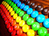
Unity: This picture is very orderly (which it is calming actually) due to the m&m's being in well ordered pairs and rows, haha like the periodic table, but its a good use of unity.
Rhythm: This picture shows a pattern using the shapes and not just a feeling of well being (like unity) but it is calming as well.
Contrast: This movie poster have the two elements of value and form, how? the lights and darks of the picture (Or if you like tints and shades). and the picture has the form and form of the lady's face.
Last but certainly not least
Variety: This movie cover has it all! (lacking maybe with some) but this picture is pretty good with the art stuff.


Great job! Be a little more specific with some descriptions - like variety! 9/10
ReplyDelete